Showing posts with label Queen Wilhelmina. Show all posts

Sunday, 2 February 2020

Moll and Levius - Dutch-Indies to Bratislava 1938

Toelangan 1938
Partially opened registered cover which was sent from Toelangan (Dutch Indies) to Bratislava on the 15th of November 1938. The Registered Fee to other countries apart from the Netherlands and colonies was 20c at that time. Add up the 15c rate to European countries and you're at 35c. Than you're still left with an extra 12c, so I guess that this is the additional Airmail Fee, although I'm not entirely sure about it. According to my resources the Airmail fee was 30c in 1938...  Nevertheless, it seems to me that all the 4 values of the Queen Wilhelmina Ruby Jubilee series of 1938 were correctly used to make up the rate to Bratislava. So this implies a non-philatelic franking!

In 1938 postal services between the Dutch Indies and other countries worldwide were already firmly established. Due to the increased volume of airmail and the introduction of telephone and radio the Indies seemed not longer 'out of reach' or on another planet in the latter half of the 1930s. Still, Queen Wilhelmina never visited her colony and governance remained very bureaucratic and rigid.

Prague cds
Reverse of the cover with 2 cds Prague transit machine cancellations  

The sender of the cover - Cornelis Lodewijk Moll - worked at SF. Kremboong. I discovered he was known as '1e Geëmpl." A chic name for an employee high up in the ranks of a factory. SF. Kremboong made sugar (SF stands for Suikerfabriek, Sugar Factory) and continues to exist as PG Krembung nowadays. When browsing through Google Streetview it seems to me nothing really has changed since the Dutch left in the 1940s. Many of the older architecture, infrastructure etc. still appear to be in use as of today!

SF Kremboong which is now known as PG Krembung. 

I couldn't find anything on Mr Moll by using Google of even the Dutch digital newspaper archives (Delpher.nl). The only time a 'C.L. Moll' pops up was in the obituary below.

Obituary of A.M. van Hamel 17-10-1925. She was the mother in law of C.L. Moll. 

Update 22-2-2020: "Mr Cornelis Lodewijk Moll was born on 28 March 1893 in Utrecht. He married Suzanna Antoinette van Hamel on 24 November 1921 in Haarlem. Suzanna was born on 22 August 1888 in Haarlem. Cornelis was a widower when he married Suzanna, and his profession is listed on his wedding certificate as ‘administrator’ (Suzanna had no profession)." All credits to Ben Jansen!

Still, Cornelis Moll remains a bit of a mystery person. But when compared to the addressee, we could state we almost knew him personally. I found nothing on the addressee. This Arpad Levius lived at the Fochgasse in Bratislava but I'm afraid he didn't survive WOII because of his Jewish sounding surname. Every combination of Arpad (not your ordinary first name) and Levius makes no sense when I put them in Google. This makes the relation between him and C.L. Moll difficult to interpret. Mr Levius might have been a customer of some sort - though Google gives me no clue if Levius or the Arpad family were merchants. Moreover, Moll addressed the letter to him personally, not using any company name etc.

Tulangan registration label
Toelangan registration label and 'Long Beam' cds reading 15.11.38.8-9 V meaning the cover was sent between 8 and 9 a.m.
Prague transit postmark

Whatever their relation has been like, the cover itself is quite a gem - albeit an incomplete entire. The destination is odd (Bratislava only had approx. 140.000 inhabitants in 1939) as is the franking. The registration label might be quite scarce as well, although Toelangan was located on the important east-west Java railway and the big city of Soerabaja lied in close proximity of SF. Kremboong. I hope that the relation between Moll and Levius will become clear one day though - even if Levius only turns out to have been an avid Dutch Indies stamp collector!

Monday, 4 November 2019

Curaçao Postal Stationery used in Medemblik?

Postal Stationery
Postal Stationery Envelope G.31 sent to Voorburg which was cancelled by the Medemblik 3 so-called 'Short Beam' postmark type on the 28th of November 1951 at 7 PM.  

This item lingered in my mind after I first saw it on Delcampe awhile ago. Not an extremely attractive entire I thought back then: a bit smudgy and bleak in a certain way. I scrolled on. For some reason I bumped into the cover again and fortunately I then did some actual research on the stationery envelope type. In the unsurpassed Geuzendam catalog for Dutch postal stationery, I found that the original envelop (without overprint) was purposed to be used on Curaçao from 1940 onwards, but for some reason the cover is only known to have been in circulation there between 1946 and 1956.

G.31 Postal Stationery
Postal Stationery Envelope G.31, recognizable because of the 'Nederland 10 cent' overprint in red.

Out of the 222.400 (!) envelopes which were printed, 122.400 received the 'Nederland 10 cent' overprint in 1950. Confusingly enough, another number in the same catalogue states that the were only 92.803 envelopes which were overprinted. Let's - for the sake of clarity- just take the fictional but not incorrect number of 100.000 as the golden mean. Postal stationery has always suffered from unfair competition with stamps on cover, so I think it's fair to say about 1% or even less of this number of envelopes survives. 100.000/100 gives 1000. So in practice that means that less than 1000 of these envelopes might have made it into 2019: most of them even likely in unused state. That simple calculation made me realize how rare this stationery type of envelope actually is. A G.31 cancelled by a Medemblik short beam postmark is probably unique. And Geuzendam rates this envelop used at a mere € 2,- !

Wilhelmina met Sluier Fokko Mees
The 1936 stamp (NVPH 126) which is similar in design to the envelope. 
The weather on the 28th of November 1951 was stormy (5/6 bft) with severe gusts of wind along the coast (bft > 10). According to an article in the Dutch Leidse Courant of 29-11-1951, the storm reached its apogee during the evening - precisely the moment our stationery envelope was sent to Voorburg, a town near The Hague and therefore close to the coast. The severity of the storm and its sudden character caused the British S.S. Teeswood to break in twain after having grounded a sandbank near the island of Rottum.  

The route which the crow might have flown between Medemblik (north) and Voorburg (south) if  the weather would have been calm on the 28th of November.   

Monday, 19 November 2018

Heldring in Venedig


PH-AKR 'Rietvink'. This DC-2 aircraft carried the letter from Bandoeng to Amsterdam Schiphol
In the 1930s the world became increasingly smaller by the introduction of regular flights between every possible destination. The aircraft industry could barely keep pace with the ever demanding airlines, which asked for safe, less noisy, air-pressured cabins and larger aircraft. Comfort and luxury were key words for 1930s passenger airlines. But aircraft were of more use than only transporting passengers: they became a very important means of transporting freight and mail. Especially the last category could be transported in large quantities. For the first time in history Dutch inhabitants of the Indies (West and East) could communicate with their relatives in the Netherlands without having to wait six or more weeks for an answer. In addition to this the leading Dutch airline (KLM) improved her service every year. In the early 1930s it took more than ten days for a KLM aircraft to fly from Bandoeng to Amsterdam. In the late 1930s new modern (American) DC-3 aircraft could make the journey in a time span of only two days! That's what you call progress!

Heldring
Letter departed Bandoeng on the 2nd of August 1935 and was probably forwarded from Amsterdam to Venice on the 20th of August. Attractive stamping of the square 12 1/2c Queen Wilhelmina 'Kreisler' and the 30c Seegers' lonely ship stamp.
This letter departed Paroengkoeda (now Parungkuda) on the 2nd of August 1936. First you might think that it arrived in Amsterdam on the 20th of the same month. A longer than usual travel time, isn't that a bit odd? With the introduction of the modern DC-2 flying machines a journey from the Indies to the Netherlands took only 5 days in the summer of 1935...so first thing what came to my mind was an engine failure. They often occurred in these days.

After a while though I wasn't so sure anymore: I looked the flight up in TSchroots' great airmail encyclopedia and read that the DC-2 'Rietvink' departed Bandoeng on the 3rd of August and arrived accordingly to its flight schedule in Amsterdam on the 8th. No engine failure whatsoever, just a lazy philatelist which jumped to conclusions too quickly.       

It think we might have been tricked by the Amsterdam postmark. This 'pseudo-arrival' postmark is probably only an indication of the time and day on which the letter was forwarded to Venice (and since you're probably more shrewd as I am, you might have guessed that already).

'Forwarding postmark' Amsterdam Central Station?
The sender of the letter was not aware of Mr Heldring's departure to Italy - obviously - so Mr Biesenbach's of Paroengkoeda letter was at the mercy of the postal services now. In these days you could still rely on such an forwarding immaculate service. The European postal agencies quickly forwarded his letter to Venice. It arrived there only two days later on the 22nd of August.

Wilhelmina
Close-up of the two stamps and postmarks

Now two questions come to mind:
  • What is the reason of the 18-day gap between the send date and forwarding date?  Did it took Heldring's family so long to forward the letter to him from their home address in Amsterdam? Or did Mr Biesenbach's letter linger in the Javanese forests for some time before reaching Bandoeng? Or...? 
  • What were Mr Heldring businesses in Kaprun and Venice? His wife (or assistant) first wrote down the wrong address (Hotel Kesselfall, Kaprun) before correcting it into the more famous Grünewald Hotel in Venice. I think the 'corrector' was perfectly aware of Mr Heldring's travel schedule. He appears to me as an important man. Moreover, his name rung a bell when my eyes met this cover. In fact, in the end I bought the cover because of this name and not because of it's attractive stamping and neat postmarks.

Ernst Heldring - Dutch entrepreneur
Much Dutchmen probably don't remember his name, and if they do they remember his name because of his son. The addressee - Ernst Heldring - nevertheless was a famous and very influential individual during the first half of the last century. Born in 1871, he was educated at the Public School of Trade in Amsterdam during the 1880s. Within 10 years he had established good contacts with the Dutch Indies where he was responsible for numerous (industrial) initiatives, such as the the construction of a harbour in Sabang and a new ship route which connected Java to Japan. He started this last venture in 1902 after having becoming president of the prestigious Royal Dutch Steamboat Company (KNSM) in 1899. Perhaps more important for philatelists is his function as president of the Royal Dutch West India Mail (KWIM) between 1912 and 1928. By that time people called him a proper shipowner ('reder' in Dutch) and in the Netherlands with its long history of trade and ships such a function meant (and still means) influence and prestige. Soon he became known as the Viceroy of Amsterdam. He made it into the upper class of Dutch society. 

Ernst Heldring on the roof of his house (De Lairessestraat 96). Viceroy of Amsterdam.
In the 1930s Heldring occupied numerous functions, most of them commissionerships, at the Dutch National Bank, the Hoogovens and the Dutch Trade Company. Most notably for our letter tracing process could have been the position he held at the Holland Bank for the Mediterranean in the mid thirties. Which sort of other business could possible distract you from simmering Italian summers.... 

For the sake of all of us, he had the extraordinary gift to keep his diary up to date. So here are some notes of his own hand, written in September 1935 which will tell you his real activities in the summer of 1935.

~
Gisteravond thuisgekomen van 4 weken vacantie in Beieren, Oostenrijk en Italië met Jet als reisgezelle. We hadden prachtig weer, behalve in de bergen, waar we ons voornemen tochten te maken moesten opgeven, toen we voldoende getraind waren. De laatste 8 à 9 dagen brachten we te Venetië, Padua en Verona, Brescia, Bergamo en Milaan door. Venetië is een oude bekende, die ik gaarne terugzie. Ditmaal was er in het Palazzo Pisaro een prachtige tentoonstelling van werken van Titiaan, waar zijn meesterschap in portretkunst, het coloriet en de compositie, doch ook zijn tekortschieten in geestelijke diepte - geheel overeenkomstig zijn tijd en omgeving - gedemonstreerd werden. Ditmaal bezocht ik ook het oud-Romaansche, half-Byzantijnsche kerkje te Torcello op een afgelegen lagune-eiland. Heel mooi. De Giotto's en Mantegna's te Padua waren een verrukking bij het weerzien na 30 jaren, zoo ook Verona. De musea in beide steden, vooral dat te Padua, vond ik uitmuntend gereorganiseerd. Te Brescia waren we slechts een paar uur tusschen 2 treinen, wegens slagregen grootendeels in een café. Het oude Bergamo op den berg gelegen met zijn door kerken en loggia's omgeven piazza is een juweel.
~
Translation:

Yesterday I returned after having spend 4 weeks of holidays in Bavaria, Austria and Italy with Jet as my travel companion. The weather was great, except in the mountains, where we had to give up our intention of making walks after sufficient training. The last 8/9 days we stayed in Venice, Padua, Verona, Brescia, Bergama and Milan. Venice is like an old acquaintance, whom I very much like to visit again. This time there was a beautiful exposition of pieces of Titian, where his mastery in portrait art, of colorite and composition, but also his under performance in philosophy- which perfectly corresponds to his age and surroundings - was demonstrated. I visited the old and small Romanic, half Byzantine church of Torcello as well this time, which stands on a remote island in the lagoon. Very pretty. To see  the paintings of Giotto and Mantegna again in Padua was a sheer delight after 30 years. The same applies to Verona. I found that the museums in both cities were very well organized, especially in Padua. Since we had to switch trains in Brescia, we had only a couple of hours to visit this city. (Unfortunately) We had to take shelter in a cafe because of a downpour. The ancient city of Bergamo situated on its mountain and its piazza surrounded by churches and loggia's is a gem.

So Mr Heldring was not for business in Italy and Austria: he enjoyed a lengthy holiday there! One mystery solved.


Thursday, 8 November 2018

Sparkling tiara's on Curaçao stamps

Last but not least in this series of studying Wilhelmina's tiara's, we will cross the Atlantic to the Dutch Caribbean. Although all stamps during Wilhelmina's reign carry the name 'Curaçao', they were used on the other Dutch Antilles as well (Aruba and Bonaire and St. Maarten, St. Eustatius and Saba). We will see that most designs match the Dutch Indies stamps, starting with the Veth 1903 series. By 1916 the new series by Seegers and Harting was introduced:

postzegel, stamp, NVPH 64
NVPH 64 - 1915 - Queen Wilhelmina 22 1/2c
postzegel, stamp, NVPH 68
NVPH 68 - 1916 - Queen Wilhelmina 50c


I always felt these designs suited the Dutch possessions in the Caribbean much better than the Dutch Indies territories. This 'feeling' might result from the fact that the Seegers' design only displays an empty horizon and a lonely ship. When thinking of the Dutch Indies I always imagine mighty volcano's and inaccessible mountain ranges which are draped in dense tropical forests. The Dutch Antilles on the other hand remind me of small windswept islands exposed to hurricanes, the sea and whatever more. The Seegers' 'lonely ship' design nears this feeling the closest, but Harting's design with its plain palm trees does invoke this same 'barren' atmosphere. Only when you try very hard, you will uncover the mystic mountain ranges of the Indies:

Detail of NVPH 68 with focus on the mountain ranges
When we continue we will see Cheffer's Jubilee design of 1923 again, which I decided not to review here again - see this post for his design.. Unlike the Dutch Indies however, the colony of Curaçao decided to grant these stamps a second life as definitive series by slightly altering the frame. It appeared between 1928 and 1930:

postzegel, stamp, NVPH 89
NVPH 89 - 1930 - Queen Wilhelmina 6c
I don't know if this design does the trick: I find myself somewhat puzzled by the three ships. I think that Mr Seegers tried reworking the frame, but he pushed the design too far by engraving three seemingly random ships below the queen in my modest opinion. I think it would have better suited the stamp to have only one ship displayed or a combination between the outline of an island and a single ship -  or even better: no display of ships at all. 

postzegel, stamp, NVPH 126
NVPH 126 - 1936 - Queen Wilhelmina 6c
Next comes a stamp which was only used on the Dutch Antilles and in Suriname, since the Dutch Indies had their own iconic square Kreisler stamps. Of course I do not want to suggest that this stamp is inferior to Kreisler's design, but I have to admit it is a bit dull ... On the other hand the designer - Mr Mees -  chose to depict Wilhelmina with a veil. This really makes her a bit magical and quite exotic. A remarkable choice and therefore the design will get my stamp of approval nevertheless. Wilhelmina seems to wear three strands of pearls on a plain tiara. I seriously doubt if Wilhelmina ever possessed a jewel of this kind.

postzegel, stamp, NVPH 138
NVPH 138 - 1938 - Queen Wilhelmina 1 1/2c
We will end with the ruby jubilee stamps which were a shared issue between the Netherlands, Suriname, Curaçao and the Dutch Indies. Mr Koch made a fine drawing of Queen Wilhelmina with the massive Wedding Gift Tiara which was so quickly dismantled after Juliana became our queen in 1948. A very stylized stamp.

Wednesday, 7 November 2018

Sparkling tiara's on Dutch Indies stamps

In my previous post I wrote about the various tiara's worn by Queen Wilhelmina which appear on Dutch stamps. Now time has come to do the same for Dutch colonial stamps (Curaçao and the Dutch Indies). While some colonial series share resemblances with Dutch stamps and are based on the same photographs, various series belong solely to the colonies. They really give you a more exotic impression when compared to the quite frugal Dutch designs. We will commence with the Dutch Indies.

Veth 1903
The first Dutch Indian series of Wilhelmina was designed by Jan Veth and introduced in 1903. Veth was also responsible for the definitive 1924-1930 series which was used in the Netherlands. His 1903 Indies design was even more attractive than his Dutch series in my opinion. Have a look at this 10c overprint variety:

postzegel, stamp, 1908
NVPH 88 - 1908 - Queen Wilhelmina 10c 'Buiten Bezit' overprint

Even with the heavy postmark and obtrusive overprint the stamp still possesses a simple grace. The overprint 'Buiten Bezit' indicates that this stamp was meant for post offices in the Dutch Indies which were not located on the isle of Java. Since this island was the first real colonial property of the Netherlands, officials used the term 'Buiten Bezit' (~ outer possessions) for the numerous other islands, especially Sumatra, Celebes and Borneo.  

Queen Wilhelmina 1897 photograph
I'm convinced Mr Veth used the photograph above for his design, the same photograph which was used for the Dutch 1899 Mouchon 'Fur Collar' stamps. Wilhelmina wore her Württemberg Ornate Pearl Tiara on that occasion but I have to admit Veth didn't succeed in engraving this tiara. He has turned it into a rather clumsy diadem on his stamps. 

postzegel, stamp, dienst, 1911
NVPH D26 - 1911 - Queen Wilhelmina 1g 'Dienst.' overprint
The stamp above belongs to the same series, but is larger in size (together with the 2 1/2g) and is embellished with two Olympic gods (Hermes and Ceres) and two ships in its frame. A very handsome design, although this particular one is gravely ruined by the 'Dienst' overprint. 'Dienst' stamps are officials.

Seegers and Harting 1913

postzegel, stamp, 1914
NVPH 120 - 1914 - Wilhelmina 20c
In the early 1910s H. Seegers designed a new series of stamps, to be used in the Dutch Indies, Curacao and Suriname. A plain engraving showing Wilhelmina en profil and a lonely ship was used for the lower values up to 50c. From 50c onwards a more elaborate and a larger stamp was used, designed by D. Harting (see below). I daresay both designers used the 1897 photograph again (15 years after it was made...) and Harting obviously did a better job. Wilhelmina's ear on Mr Seegers' stamp is simply too grotesque.  

postzegel, stamp, 1913
NVPH 132 - 1913 - Queen Wilhelmina 1g
What I do like when looking at Harting's stamp is the very exotic though elegant framework. Much attention has been given to design the denomination and country designation, which makes me think of this stamp as a particularly charming one.     

Jubilee 1923

postzegel, stamp, 1923
NVPH 162 - 1923 - Queen Wilhelmina 20c
In 1923 Wilhelmina had reigned for 25 years: a jubilee which the P.T.T. did not miss. In the Netherlands and the colonies series of stamps were issued which commemorated her achievement. The colonial stamps differed a great deal from the Dutch series, which was designed in art deco style. The stamp above though can be described as very conservative and '19th centurish', but was apparently deemed perfectly apt for the Dutch colonies associated with all their opulence and richness. We see a heavily illuminated frame surrounding Wilhelmina who wears a grand diadem. You could almost imagine that this diadem should be called the 'pearl of the Indies' when taking its gigantic proportions into consideration. Not frugal at all and very un-Dutch. On top of this she wears an eye-catching necklace. 

1923 photograph by H. Deutmann
In the archives I found the photo on which the series was based. Cheffer made the excellent engraving, whilst Seegers resorted to the framework. He probably hadn't forgot his clumsy ear (nor had the P.T.T.), but he made it up by lovely adorning this series. Wilhelmina wears the so-called Wedding Gift Tiara. Because of its gigantic proportions her daughter - queen Juliana - had dismantled the parure when she became queen. Maybe she thought it a too opulent display for the Netherlands, especially after we lost the Indies in 1949.  

Kreisler 1934

postzegel, stamp, 1934
NVPH 196 - 1934 - Queen Wilhelmina 12 1/2c
To complete the Indies diadem tour, we cannot exclude Kreisler's magnificent 1934 Wilhelmina series. Why magnificent? Well, he dared to present the P.T.T. with a square stamp design. That was a first and a gamble. Moreover, his design consists out of a very humble but at the same time proud depiction of the queen within a neat though elegant framework. This and the combination of native art with two important Dutch elements (shipping & infrastructure) makes the stamp truly iconic. Where the 1923 jubilee series overwhelms you a bit too heavily, this stamp does not make any presumptions. That's quite an achievement, since Wilhelmina is depicted with her Wedding Gift Tiara again. Kreisler didn't make this diadem look preposterous though (a feeling which I got with the jubilee series), since the diadem softly sinks away in her hair. Very refined. 

Wednesday, 24 October 2018

Sparkling tiara's on Dutch stamps


Last night a grand state banquet was held in Buckingham Palace in honour of the state visit of King Willem-Alexander and Queen Maxima to the United Kingdom. A historic state visit, since Willem-Alexander is the third (!) monarch of the Netherlands to visit the U.K. during Queen Elizabeth’s reign. Whilst Brexit was certainly discussed, the king’s speeches to the U.K. parliament and Queen Elizabeth stayed both very diplomatic (as was expected) and amicable.  

In the months and weeks prior to the state visit, many royalty experts eagerly discussed the possibility of Queen Máxima wearing the so-called Stuart Tiara (and accompanying parure) which was last worn by Queen Juliana (reign: 1948-1980) in the 1970s. Her daughter queen Beatrix (reign 1980-2013) never seemed to have worn the set in public. She might have had her personal reasons not to wear it, but certainly its absolute stunning extravagance (see photo below) will not escape anybody's attention. 

Queen Juliana

The tiara itself is massive and was ordered by Queen Emma for her daughter Wilhelmina on the occasion of her inauguration in 1898. Its absolute piece de resistance is the fabulous Stuart Diamond which has been in possession of the Dutch royal family for centuries. Stadtholder-King William III of the Netherlands and England acquired this uncut diamond for his wife Mary in 1690 and in the same year an Amsterdam diamond cutter polished it into a heavy 39,75 carat gem.

Willem III
NVPH 1407 - 1988 - 75c
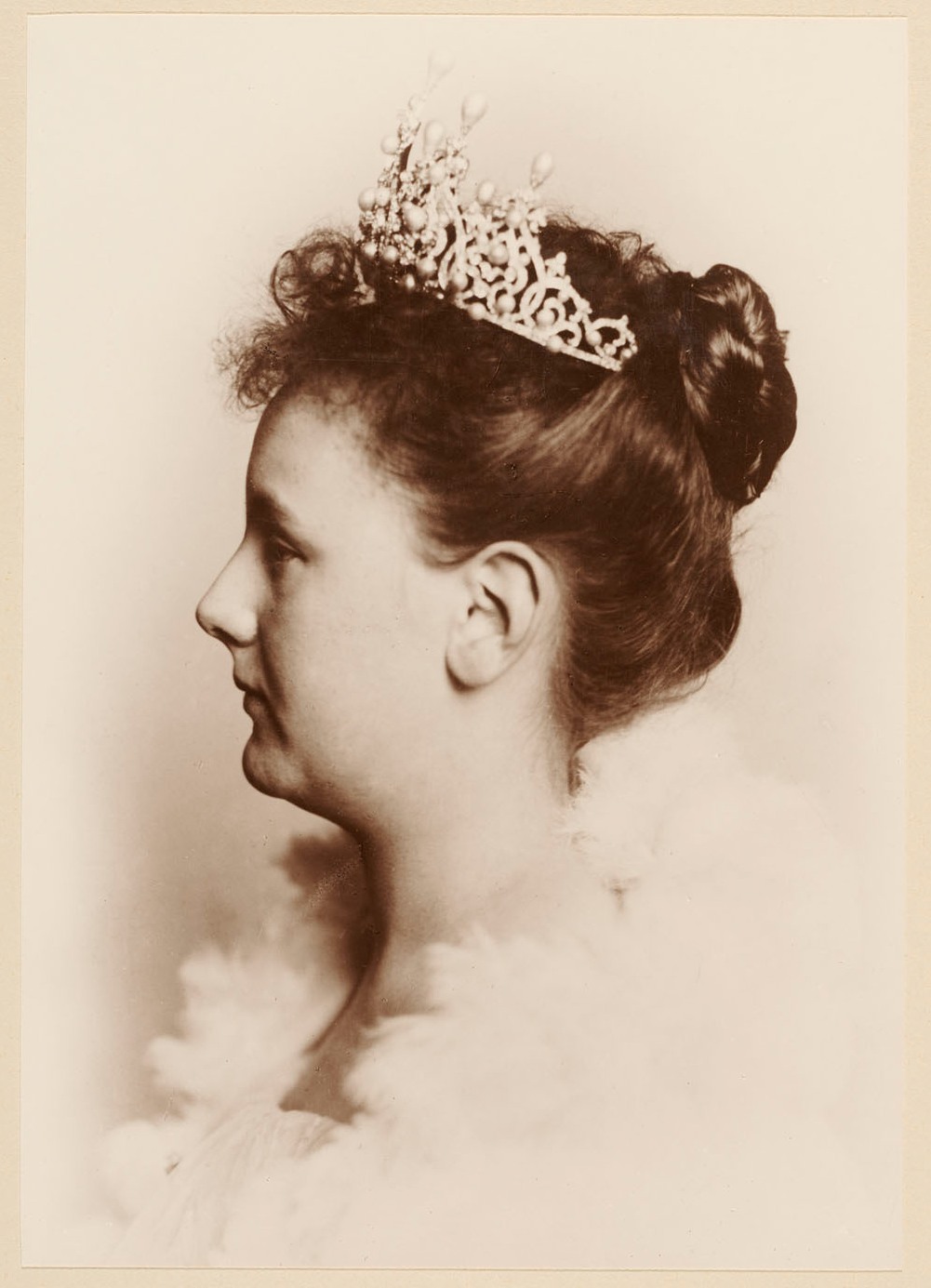
Some people deem the tiara itself already over-the-top, let alone with the Stuart and the accompanying diamonds added! Queen Máxima however did not think it was too pompous and – to the absolute delight of many royalty fans and gemmaphiles – the Stuart sparkled on the queen’s head yesterday after decades in the Dutch royal vault.

Stuart diamond
Queen Máxima with the Stuart Diamond tiara in Buckingham Palace yesterday
This story inspired me to look at Dutch (colonial) stamps bearing engravings/photo’s of queen Wilhelmina and Juliana, as I knew some of them depicted tiara’s as well. Of course I wondered if the Stuart tiara was ever portrayed on a Dutch stamp… I soon found out though that it proved very hard to precisely determine the small and sometimes roughly engraved tiara’s. Moreover, it appeared to me that some tiara’s on these stamps seemed to have vanished altogether…or even never existed in the first place. Please read my report below. In this particular post I will pay attention to tiara’s on Dutch stamps only. Mu next post will discuss Dutch colonial stamps.

Inauguration of Queen Wilhelmina and subsequent 'Fur collar' series

NVPH 77
NVPH 77 - 1899 - Queen Wilhelmina 1g
On the occasion of Wilhelmina’s inauguration in 1898 the P.T.T. issued a so-called inauguration stamp which is almost identical to the stamp above. This stamp though is part of the high value definitive ‘Wilhelmina Fur Collar' series which is considerably cheaper than the real inauguration stamp...and therefore saves me some money.

When we look closely we see that the young queen wears a tiara – but after an even closer inspection we observe that it is not the Stuart tiara, which was specifically made for her inauguration! A real shame she was not portrayed with the Stuart here. Instead she seems to wear the so-called Württemberg Ornate Pearl Tiara. This tiara was probably crafted in 1897 and – contrary to popular belief – has nothing to do with Sophie of Württemberg (first wife of king William III). Queen Beatrix was apparently quite fond of the piece but often wore it without the characteristic pearl ‘toppers’ – too preposterous to her likens I guess? Sometimes though, on very special occasions she did add the pearls, for example while she visited Queen Elizabeth in 1982 or on the eve of her abdication in 2013. The Württemberg tiara can be found on all other stamps of the ‘Fur Collar’ series of 1899-1921.

Wilhelmina bontkraag NVPH 71
NVPH 71 - 1899 - Queen Wilhelmina 15c

Definitive series queen Wilhelmina 'Veth' 1924-1930  

Wilhelmina Veth postzegel NVPH 165
NVPH 165 - 1926- Queen Wilhelmina 5g 

The first stamps of the next definitive series of queen Wilhelmina were issued in 1924 and they bear a handsome engraving of her with a different tiara. I’ve chosen the 5 guilder as example here, since it was printed in a larger size than the lower values. After searching a while through some online depots, I found the following two drafts of designer Jan Veth. 

2nd draft by Veth
1st draft by Veth

It strikes me that in the first draft he had drawn the Württemberg tiara, while in the second one he obviously opted for a different tiara. A problem remained though: I couldn’t find a single tiara belonging to the royal family with at least 9 pearls on one side. It seems to me Prof. Veth produced a brand new tiara out of his pencil…

1931 Photo Queen

Wilhelmina 1931 NVPH 237
NVPH 237 - 1931- Queen Wilhelmina 80c 

A special stamp appeared in 1931 with a photo of Queen Wilhelmina. A first, since the P.T.T. had never used photo’s on its stamps before. In 1933 the 80c value was issued. Because of the photo we do not have to be afraid some designer made up an artificial tiara (or do we?). Still, it was not easy to trace down this particular tiara as the photo quality isn’t spectacular and we only see Wilhelmina en profil . After comparing it to other stamps (especially colonial ones) and the 40th anniversary of Wilhelmina’s reign stamp of 1938, I’m fairly convinced though that this is the so-called Wedding Gift Tiara. A Dutch jeweler crafted this now-lost voluminous diamond and sapphire tiara in 1900 on the occasion of Wilhelmina’s wedding to Henry of Mecklenburg-Schwerin in 1901.


Juliana had dismantled this tiara – maybe because of its sheer size – and several new jewels were made out of it for her daughters.  

Crisis 1934

Wilhelmina Crisiszegel 1934 NVPH 265
NVPH 265 - 1934- Queen Wilhelmina 5c
In 1934 the P.T.T. issued two charity stamps on behalf of the Dutch National Crisis Committee. The other stamp bears an image of princess Juliana – alas without a tiara! On the depicted stamp we observe a very regal queen Wilhelmina wearing a tiara, but we’re in for a second disappointment: this is also an imaginary fabrication of an artist (Fokko Mees). The photo upon which this engraving was based is the same one which was used for the 1931 stamp with the Wedding Gift Tiara (see below).


Fokko Mees did draw a more true to nature draft version though:


Ruby Jubilee 1938

In 1938 a series of stamps was issued in honour of queen Wilhelmina’s 40th ‘ruby’ jubilee. A fine and detailed drawing by designer Pijke Koch can be found online. She does wear the Wedding Gift Tiara here again.    


40-jarig jubileum Wilhelmina NVPH 311
NVPH 311 - 1938 - Queen Wilhelmina 5c
Drawing by Pijke Koch


1940-1947 definitive series Queen Wilhelmina 'Konijnenburg'

Wilhelmina Konijnenburg NVPH 332
NVPH 332 - 1940 - Queen Wilhelmina 5c
Last but not least we have the so-called Konijnenburg definitive series, named after designer Willem van Konijnenburg. He produced plain but very elegant stamps but had the misfortune that his series was printed in the spring of 1940 and therefore saw only limited use during WWII. Even more unfortunate was that he died of flu in 1943 and therefore never enjoyed a liberated Holland again. His stamps though were granted a proper renaissance when they were reprinted after the war. The lower values were based upon a drawing of Konijnenburg, but the higher values (1,2½, 5 and 10 guilder) only appeared for the first time after the war. They differed from the lower values in size and were handsomely engraved by Sem Hartz. Luckily engraved portraits were not something of the past yet!

Wilhelmina Konijnenburg Hartz NVPH 349
NVPH 349 - 1946 - Queen Wilhelmina 1g
If I'm not mistaken Queen Wilhelmina wears the so-called ruby Mellerio Tiara on these stamps. Especially the engraved version clearly shows us this particular tiara. I was grateful to find an original drawing of Van Konijnenburg and the photo upon which he modeled his stamp:

Queen Wilhelmina with Mellerio Tiara
Drawing by Willem van Konijnenburg - 1939
The Mellerio Parure is a set of jewels which the royal family owns since the late 1800s. William III asked the French jeweler Mellerio to craft a tiara, necklace, brooches and armbands for his second wife Queen Emma. He acquired it for a mere ƒ160,000 in 1889...

Koningin Máxima Mellerio
Queen Máxima with the Mellerio tiara

Thursday, 12 July 2018

Netherlands 1939: Dutch express letter by train

Apart from my interest in retrieving information about senders and addressees, contents and messages, I occasionally include covers / postcards in my collection because the postal rate or postal markings intrigue me. The cover below is such an example:


This letter was sent to the 'Dutch agricultural head office' by making use of the Dutch express service. Voermans & Backx had to pay 10c extra to make this a valid express letter. The label 'Spoedbestelling / Exprès / Spoedbestelling' was hence applied which made the PTT aware that this was a special delivery. In these days - and today still - the service was provided for by a separate agency of the postal service, which meant that 'ordinary' postmen weren't allowed to process the item.  

If you carefully read the address of the sender (Voermans & Backx) you might notice that this company which traded in agricultural products was situated alongside the 'Stationsstraat', Dutch for Station Road in Roosendaal. The combination of this address and the unorthodox cancel made me flip the cover: 


A third stamp is glued to the back flap of the cover! And it is no ordinary one:  


It turns out to be a so-called 'Railway stamp', a type of stamp which was used by various countries in the world to pay the cost of the conveyance of a postal item by train. A steam locomotive adorns the stamp and the text reads: Nederlandse Spoorwegen: the Dutch Railways (NS). 

The marvelous book about Dutch express delivery by Arie Zonjee and Ot Louw (2013) devotes a chapter to the Dutch Rail Express Service:

From 1924 onwards the Dutch Railways (NS) made it possible to send express items by train. In order to do so, the sender had to pay the standard PTT Express fee of 10c + and an extra Train Express fee of 10c. The Dutch Railways produced their own stamps in order to comply with this service. The guard on the train took care for the items during the ride. The (Railway) stamps were to be cancelled with a NS cancel of the local luggage center from which the items were being sent. 

The example above was cancelled at Roosendaal Station on the 4th of May 1939 and arrived in The Hague the same day between 1 and 2 p.m. 

Why did the sender chose to sent this particular cover by train instead of the ordinary service? Maybe this was the fastest way to get the letter from a to b. I doubt this, as the ordinary express service would be almost as fast. Maybe the station was easier to reach than the main post office of Roosendaal. Quite possible, but - then again - most railway stations had a PTT office as well... Oh well, it makes a fine example of a Dutch train cover after all!


Oily forwarding mystery - Delft to Port Swettenham via Babo

Newspaper wrapper sent from Delft 17-1-1938 via Pladjoe and Babo to Port Swettenham via Singapore (4-6-1938) The newspaper wrapper shown abo...