In my
previous post I wrote about the various tiara's worn by Queen Wilhelmina which appear on Dutch stamps. Now time has come to do the same for Dutch colonial stamps (
Curaçao and the Dutch Indies). While some colonial series share resemblances with Dutch stamps and are based on the same photographs, various series belong solely to the colonies. They really give you a more exotic impression when compared to the quite frugal Dutch designs. We will commence with the Dutch Indies.
Veth 1903
The first Dutch Indian series of Wilhelmina was designed by Jan Veth and introduced in 1903. Veth was also responsible for the definitive 1924-1930 series which was used in the Netherlands. His 1903 Indies design was even more attractive than his Dutch series in my opinion. Have a look at this 10c overprint variety:
 |
| NVPH 88 - 1908 - Queen Wilhelmina 10c 'Buiten Bezit' overprint |
Even with the heavy postmark and obtrusive overprint the stamp still possesses a simple grace. The overprint 'Buiten Bezit' indicates that this stamp was meant for post offices in the Dutch Indies which were not located on the isle of Java. Since this island was the first real colonial property of the Netherlands, officials used the term 'Buiten Bezit' (~ outer possessions) for the numerous other islands, especially Sumatra, Celebes and Borneo.
 |
| Queen Wilhelmina 1897 photograph |
I'm convinced Mr Veth used the photograph above for his design, the same photograph which was used for the Dutch 1899 Mouchon 'Fur Collar' stamps. Wilhelmina wore her Württemberg Ornate Pearl Tiara on that occasion but I have to admit Veth didn't succeed in engraving this tiara. He has turned it into a rather clumsy diadem on his stamps.
 |
| NVPH D26 - 1911 - Queen Wilhelmina 1g 'Dienst.' overprint |
The stamp above belongs to the same series, but is larger in size (together with the 2 1/2g) and is embellished with two Olympic gods (Hermes and Ceres) and two ships in its frame. A very handsome design, although this particular one is gravely ruined by the 'Dienst' overprint. 'Dienst' stamps are officials.
Seegers and Harting 1913
 |
| NVPH 120 - 1914 - Wilhelmina 20c |
In the early 1910s H. Seegers designed a new series of stamps, to be used in the Dutch Indies, Curacao and Suriname. A plain engraving showing Wilhelmina en profil and a lonely ship was used for the lower values up to 50c. From 50c onwards a more elaborate and a larger stamp was used, designed by D. Harting (see below). I daresay both designers used the 1897 photograph again (15 years after it was made...) and Harting obviously did a better job. Wilhelmina's ear on Mr Seegers' stamp is simply too grotesque.
 |
| NVPH 132 - 1913 - Queen Wilhelmina 1g |
What I do like when looking at Harting's stamp is the very exotic though elegant framework. Much attention has been given to design the denomination and country designation, which makes me think of this stamp as a particularly charming one.
Jubilee 1923
 |
| NVPH 162 - 1923 - Queen Wilhelmina 20c |
In 1923 Wilhelmina had reigned for 25 years: a jubilee which the P.T.T. did not miss. In the Netherlands and the colonies series of stamps were issued which commemorated her achievement. The colonial stamps differed a great deal from the Dutch series, which was designed in art deco style. The stamp above though can be described as very conservative and '19th centurish', but was apparently deemed perfectly apt for the Dutch colonies associated with all their opulence and richness. We see a heavily illuminated frame surrounding Wilhelmina who wears a grand diadem. You could almost imagine that this diadem should be called the 'pearl of the Indies' when taking its gigantic proportions into consideration. Not frugal at all and very un-Dutch. On top of this she wears an eye-catching necklace.
 |
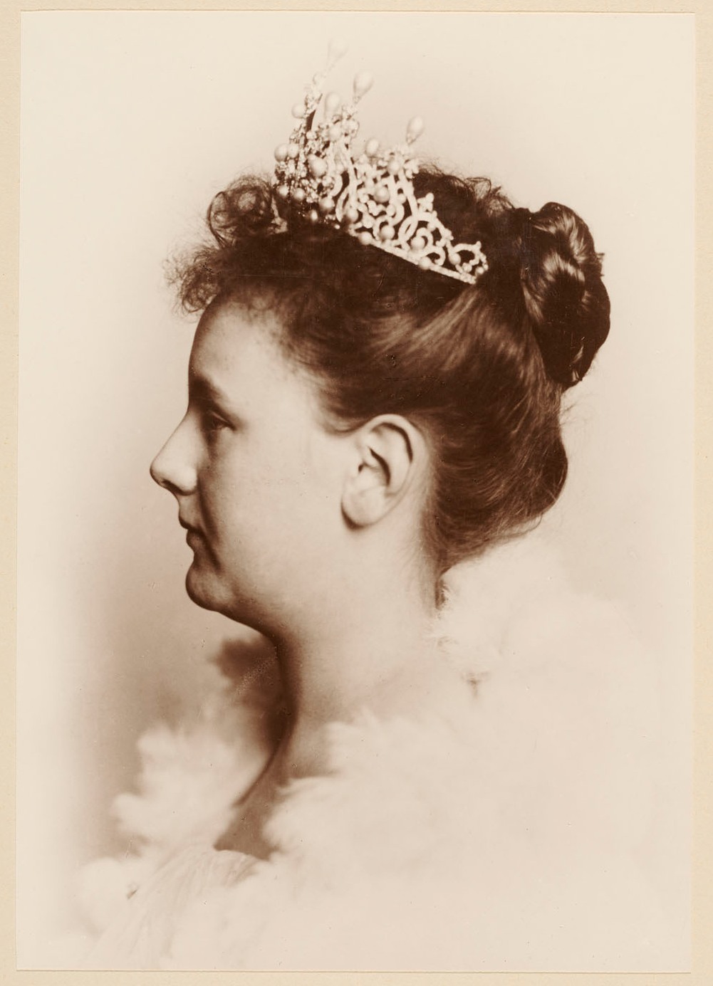
| 1923 photograph by H. Deutmann |
In the archives I found the photo on which the series was based. Cheffer made the excellent engraving, whilst Seegers resorted to the framework. He probably hadn't forgot his clumsy ear (nor had the P.T.T.), but he made it up by lovely adorning this series. Wilhelmina wears the so-called Wedding Gift Tiara. Because of its gigantic proportions her daughter - queen Juliana - had dismantled the parure when she became queen. Maybe she thought it a too opulent display for the Netherlands, especially after we lost the Indies in 1949.
Kreisler 1934
 |
| NVPH 196 - 1934 - Queen Wilhelmina 12 1/2c |
To complete the Indies diadem tour, we cannot exclude Kreisler's magnificent 1934 Wilhelmina series. Why magnificent? Well, he dared to present the P.T.T. with a square stamp design. That was a first and a gamble. Moreover, his design consists out of a very humble but at the same time proud depiction of the queen within a neat though elegant framework. This and the combination of native art with two important Dutch elements (shipping & infrastructure) makes the stamp truly iconic. Where the 1923 jubilee series overwhelms you a bit too heavily, this stamp does not make any presumptions. That's quite an achievement, since Wilhelmina is depicted with her Wedding Gift Tiara again. Kreisler didn't make this diadem look preposterous though (a feeling which I got with the jubilee series), since the diadem softly sinks away in her hair. Very refined.